Adjust Menu Appearance
If you’re familiar with Elementor, you will find out adjusting menu appearance is easy. Everything is live.
Table of Content
Once you have dragged-and-dropped the “Elemental Menu” widget into a column or a section, your screen may look like this:
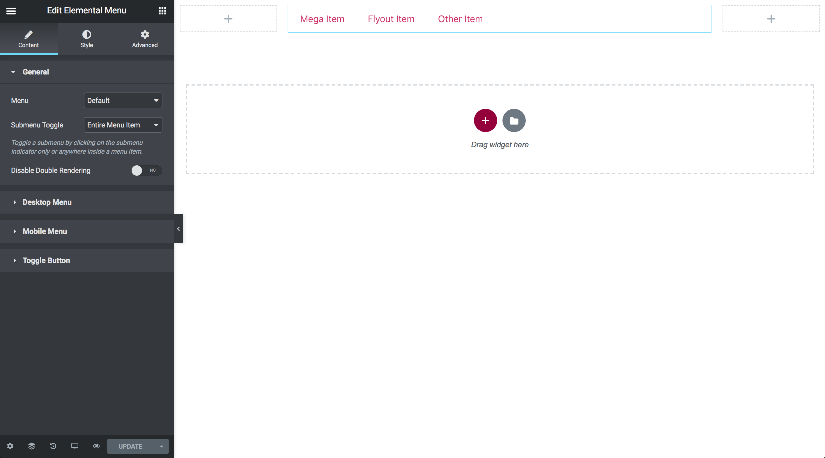
On the left side is Elemental Menu control panel. There’re tabs, sections and controls which allow you to adjust menu appearance however you want. Let’s get down to the details:
1. Content tab
The “Content” tab contains sections with controls which allow you to decide what to show, hide or how things should be rendered and behave.
1.1. General section
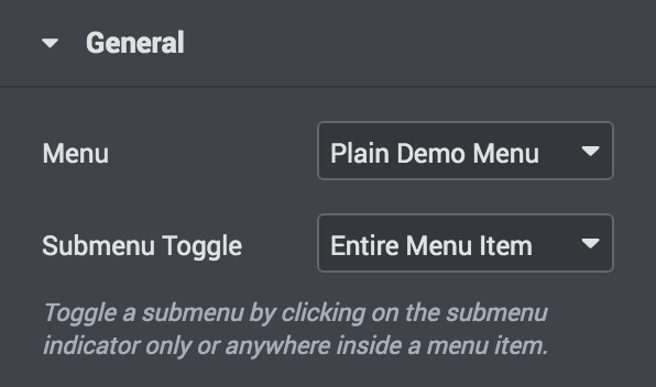
- Menu: Select the menu you want to display.
- Submenu Toggle: On touch-screen devices or when Toggle Submenu On Click is enabled, there’s no hover effect. Then, where should users click/tap on to toggle a submenu?
1.2. Desktop Menu section
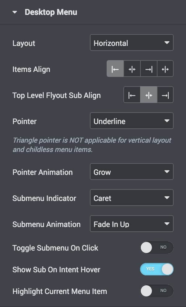
- Layout: Layout to display the menu on Desktop. If “Hidden” selected, Desktop Menu won’t be rendered on the frontend.
- Items Align: Alignment of menu items. For “Horizontal” layout only.
- Text Align: Alignment of the text labels of menu items.
- Top Level Flyout Sub Align: Alignment of the top level flyout submenus. For “Horizontal” layout only.
- Pointer: Select a pointer which indicates that a menu item is being active/hover/focus.
- Pointer Animation: Animation of the Pointer.
- Submenu Indicator: Select an icon which indicates that a menu item has a submenu.
- Submenu Animation: Select an entrance animation of submenus.
- Toggle Submenu On Click: If enabled, a submenu can be toggled by clicking only.
- Show Submenu On Intent Hover: If enabled, a submenu will show up by intent hover only.
- Highlight Current Menu Item: Whether to highlight the Current Menu Item or not. Active colors and Pointer will be used without animation.
- Hide Current Menu Item Pointer: Whether to hide the Pointer of the Current Menu Item or not. For Vertical layout only.
- Push Sub Indicator To The End: Whether to push the Submenu Indicator to the end side of a menu item or not. For “Vertical” layout only.
1.3. Mobile Menu section
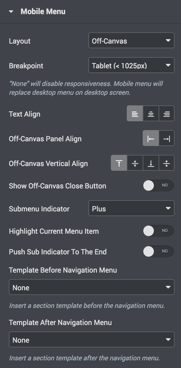
- Layout: Layout to display the menu on Mobile. If “Hidden” selected, Mobile Menu won’t be rendered on the frontend.
- Breakpoint: At which point should the Mobile Menu be displayed instead of the Desktop Menu?
- Text Align: Horizontal alignment of the text labels of menu items.
- Off-Canvas Panel Align: Alignment of the Off-Canvas Panel. For “Off-Canvas” layout only.
- Off-Canvas Vertical Align: Vertical alignment of content inside the Off-Canvas Panel. For “Off-Canvas” layout only.
- Show Off-Canvas Close Button: Whether to show the close button of the Off-Canvas Panel or not. For “Off-Canvas” layout only.
- Default Heading Type: Select a heading type that will be displayed by default on the Paged Menu Header. For “Paged” layout only.
- Dropdown Overlap: If enabled, the Dropdown Panel will extend over other content instead of pushing them down. For “Dropdown” layout only.
- Dropdown Full Width: Stretch the Dropdown Panel to full screen width. For “Dropdown” layout only.
- Submenu Indicator: Select an icon which indicates that a menu item has a submenu.
- Highlight Current Menu Item: Whether to highlight the Current Menu Item or not. Active colors will be used without pointer and animation.
- Push Sub Indicator To The End: Whether to push the Submenu Indicator to the end side of a menu item or not.
- Template Before Navigation Menu: Insert an Elementor section template before the selected navigation menu.
- Template After Navigation Menu: Insert an Elementor section template after the selected navigation menu.
1.4. Toggle Button section
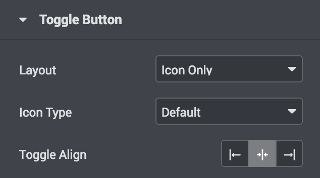
- Layout: Select a layout to display the button.
- Toggle Selector: Define a custom toggle button instead of the built-in one.
- Text Label: Text label of the toggle button.
- Icon Type: Choose default icon type or a custom type.
- Default Icon: Icon to display when the button is not toggled.
- Close Icon: Icon to display when the button is toggled.
- Toggle Align: Alignment of the button.
1.5. Off-Canvas Close Button section
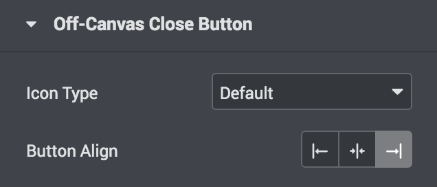
This section is available when you enabled the “Show Off-Canvas Close Button” option.
- Icon Type: Choose default icon type or a custom type.
- Button Align: Alignment of the button.
2. Style tab
The “Style” tab contains sections with controls which allow you to decide how the menu will look like by adjusting Typography, Colors, Padding…
2.1. Desktop Menu section
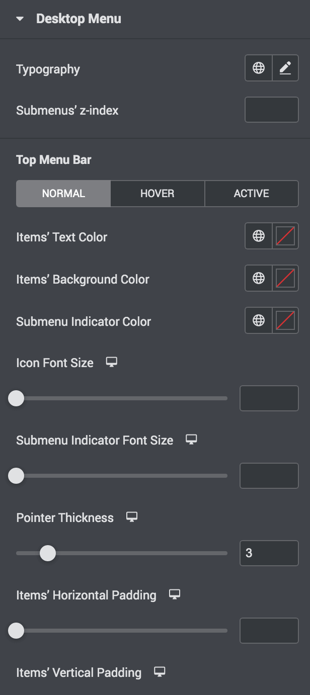
This section contains controls to adjust appearance of the Desktop Menu.
The control labels are descriptive and everything is live. Please try it yourself if you’re not sure how things work.
2.2. Mobile Menu section
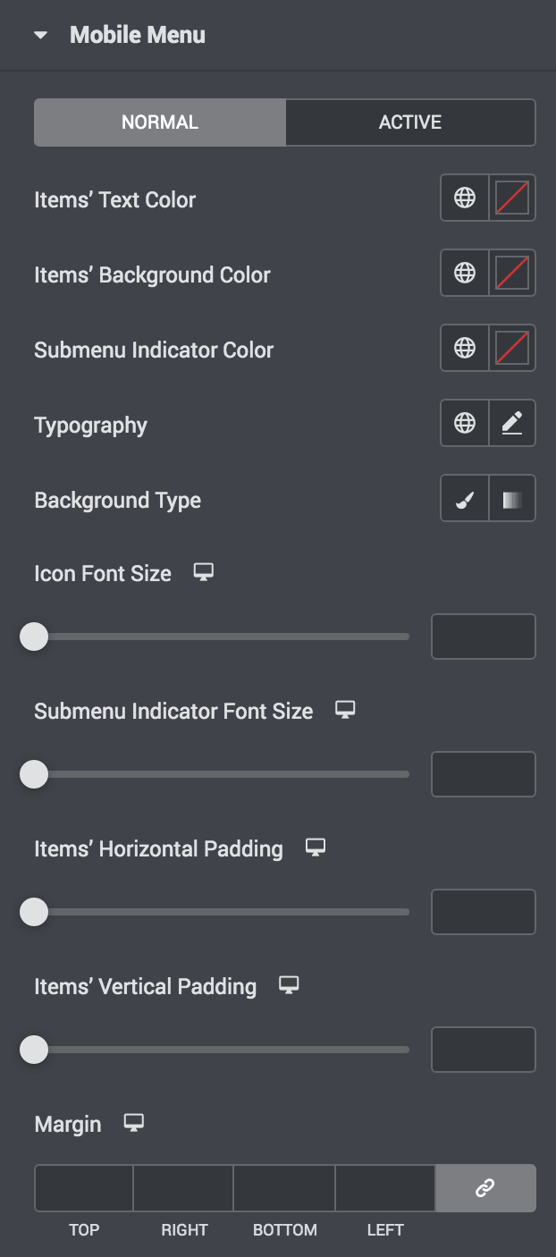
This section contains controls to adjust appearance of the Mobile Menu.
The control labels are descriptive and everything is live. Please try it yourself if you’re not sure how things work.
2.3. Toggle Button section
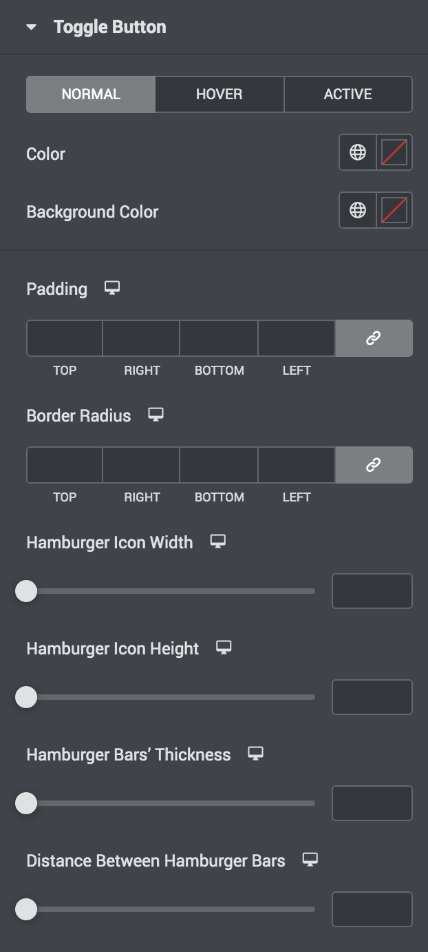
This section contains controls to adjust appearance of the default Toggle Button.
The control labels are descriptive and everything is live. Please try it yourself if you’re not sure how things work.
3. Advanced tab
This tab contains default advanced options of Elementor and Elementor Pro. The plugin does not add any option to this tab.