Getting Started
Table of Content
1. Requirements
All you need is an active installation of the Bricks Builder version 1.9.9 or greater.
2. Installation
If you’re familiar with installing a WordPress plugin, just go ahead with the standard routine.
If you’re new to WordPress, please refer to WordPress codex’s instruction to know how to install a plugin.
3. Terminologies
3.1. Normal Submenu
A Normal Submenu is a submenu which contains just the standard menu items only:

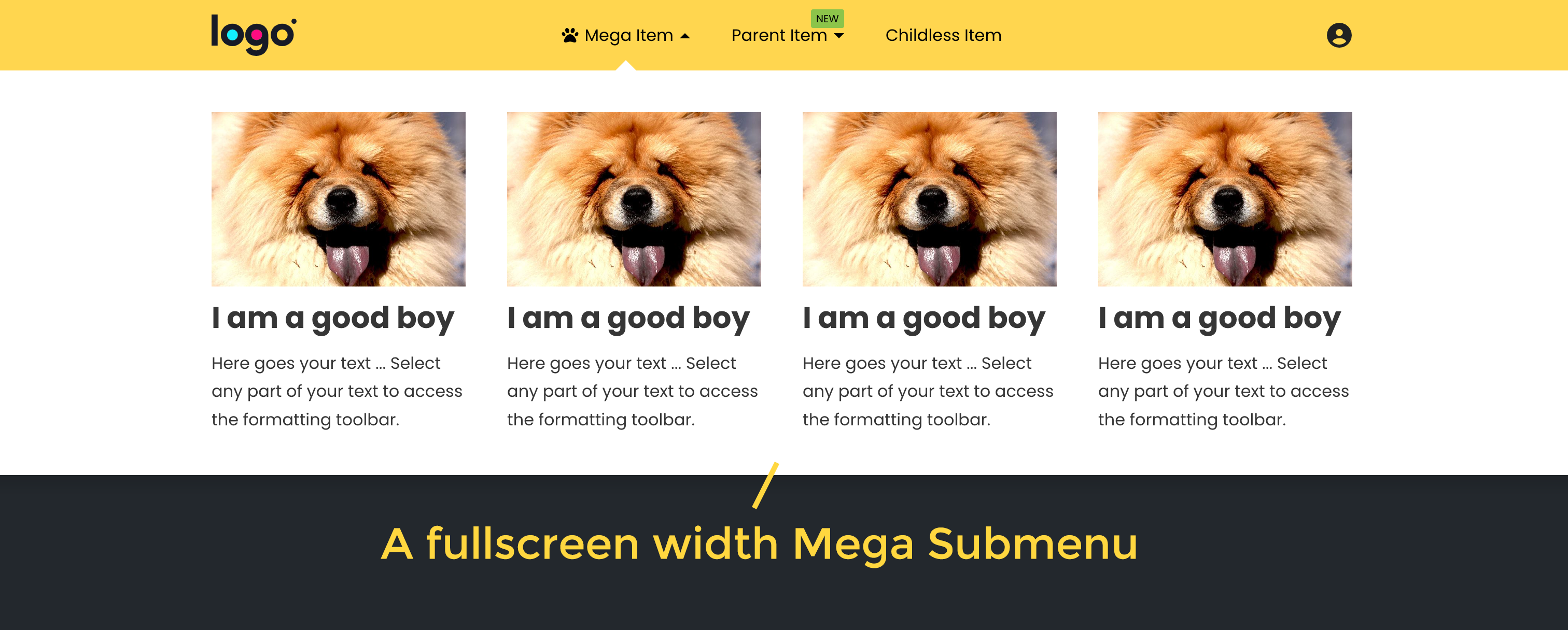
3.2. Mega Submenu
A Mega Submenu is a submenu which contains extensive content rather than just the standard menu items:
3.3. Mega Item
A Mega Item is a parent menu item which has a Mega Submenu
3.4. Mega Menu
A Mega Menu is a whole menu which contains menu item(s) and has at least one Mega Item.
3.5. Top-Level Submenu & Sub-Level Submenu
- Top-Level Submenu is either a Mega Submenu or the very first Normal Submenu.
- Sub-Level Submenu is a submenu of a submenu, regardless its level.
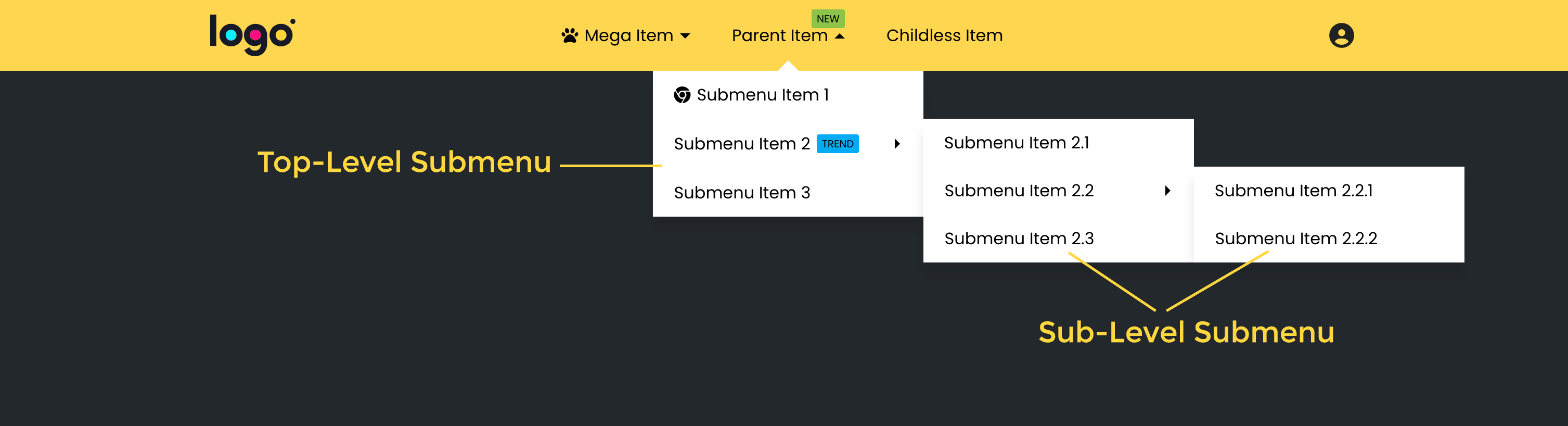
*Please note that these terms are relative to the closet menu container, not the outmost menu container.
3.6. Top-Level Items & Sub-Level Items
Below image illustrates the terms:
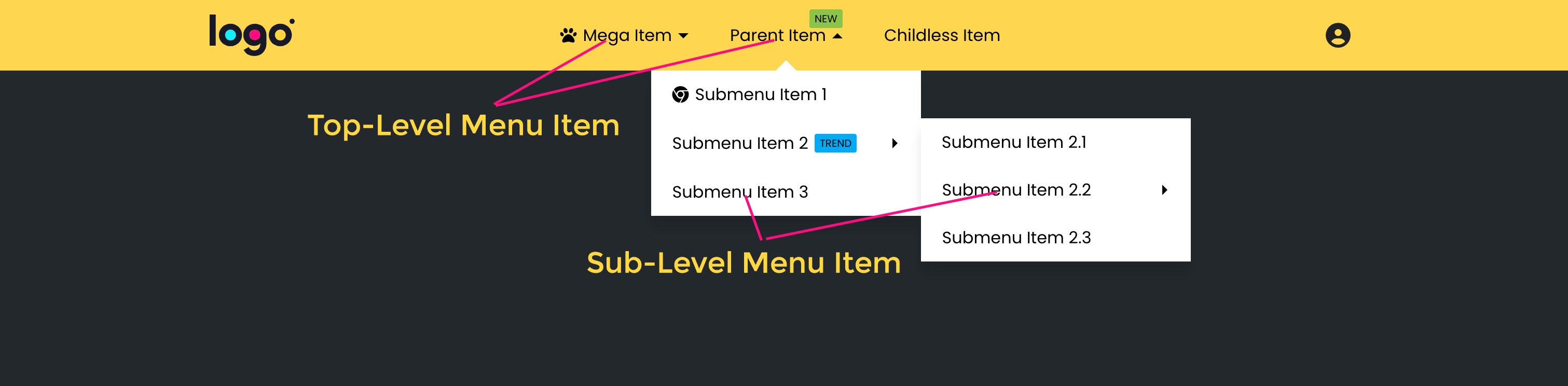
*Please note that these terms are relative to the closet menu container, not the outmost menu container.
3.7. Icon, Badge, Item Label & Submenu Indicator
Below image illustrates the terms:

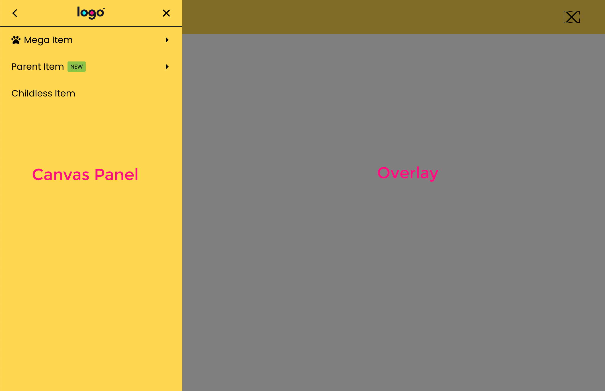
3.8. Off-Canvas (Canvas) & Overlay
Canvas Panel is a panel which is hidden by default. By clicking on the menu toggle button, this panel will appear, covers entire screen with or without an overlay and temporarily block the page behind it from interaction:
Overlay is the mask layer which covers part of the page when a Menu is active. For example, the dark transparent layer below:
3.10. Dropdown Panel
Dropdown Panel is a panel which is also hidden by default. By clicking on the menu toggle button, this panel will drop down as you can see in the image below. It does not cover entire screen or block the page behind it from interaction.
You can close a Dropdown Panel by clicking on the menu toggle button only.
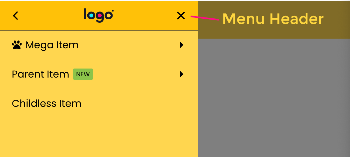
3.11. Menu Header
Menu Header is the top section of a Paged Off-Canvas Menu.
3.12. Initial Bubble
It’s the circle behind the Toggle Button of a Fullscreen Menu with “Bubble” entrance animation of the Off-Canvas:

That’s all to get started. Let’s move to the next topic: Menu Elements
Last modified: Jul 19 2025 at 11:17 AM.