Responsive Editing
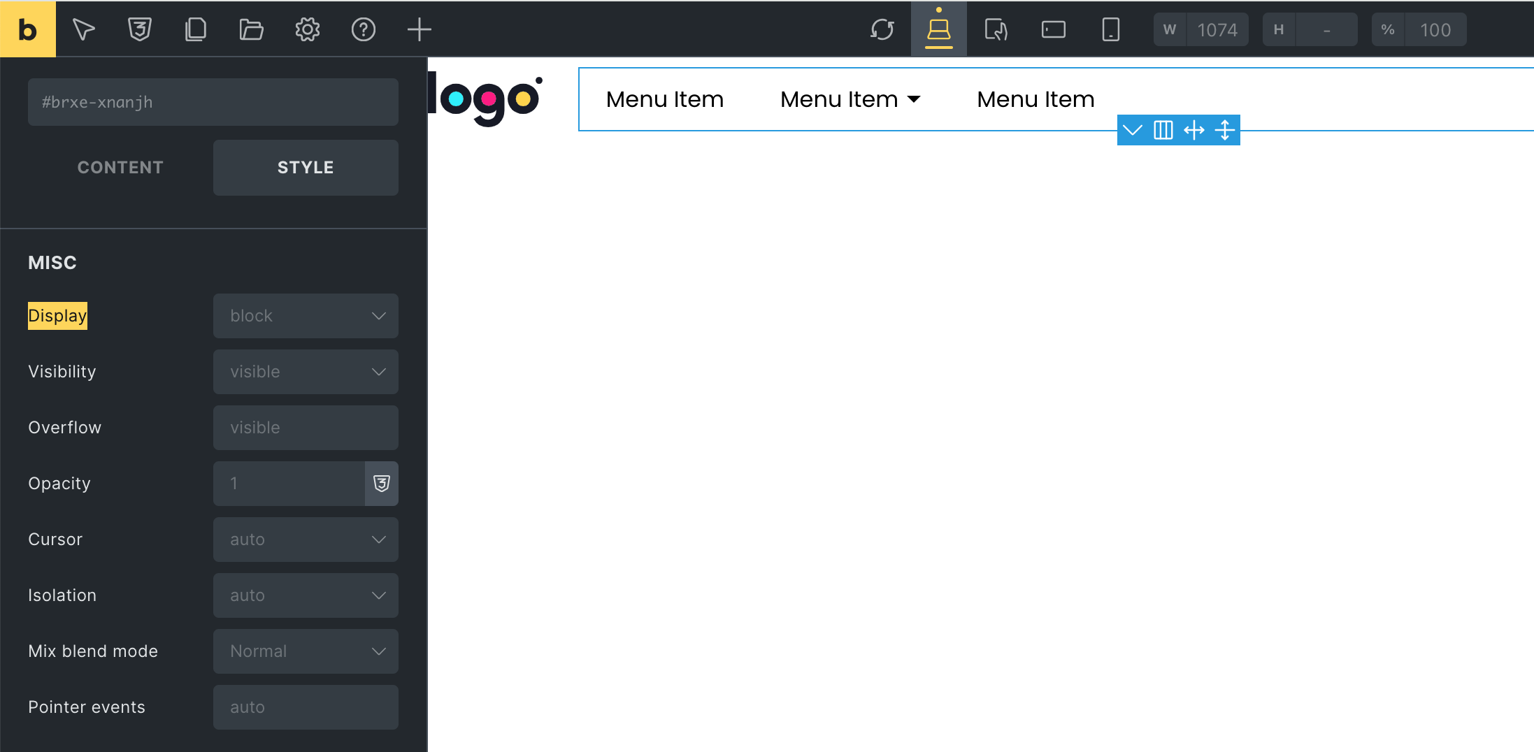
Mortar Menu doesn’t support the traditional responsive method. Desktop Menu won’t be automatically transformed into a Mobile Menu at a certain breakpoint. Instead, you build a different menu for Mobile and decide when & where to show it with the Bricks’ Display control:

Why Mortar Menu doesn’t support the traditional responsive method?
After years of building navigation menus, below are what we have learned:
The Pros of the traditional responsive method
1. Maybe save time
If Desktop Menu and Mobile Menu have the same content, it does save you some minutes of copying elements.
If they don’t have the same content, the time to show/hide elements based on breakpoints might not save your time.
2. Less HTML output
For simple menu layouts like Dropdown or Off-Canvas, we don’t need to render Mobile Menu separately. CSS & JS can help transform a Desktop Menu into a Mobile Menu. It may save some kilobytes of the HTML output.
People often misunderstand that there are less HTTP requests as well. It’s not true. All modern browsers support HTTP caching. So, two menus having the same content will do the same amount of HTTP requests as one menu.
The Cons of the traditional responsive method
1. Less freedom & flexibility
When a Mobile Menu is implicitly rendered along with a Desktop Menu, you can’t control where it will be displayed.
And since a Desktop Menu will be transformed into a Mobile Menu automatically, the layout of content on the Mobile Menu is likely hardcoded.
2. Not well supported by Bricks
Bricks builder doesn’t support an all-in-one element. It is against Bricks’ methodology.
You may think of the Nav (Nestable) element. It works because the mobile menu of that element is pretty simple
3. Doesn’t work with advanced menu layouts
For advanced menu layouts, CSS and JS alone can’t help transform a Desktop Menu into a Mobile Menu. The Paged layout for example. Sites such as Adidas and Nike still have to render two separate menus for Desktop and Mobile.
Even if it’s possible, extra code to manipulate the DOM is risky for SEO and accessibility.
4. Massive amount of controls will confuse users
If controls of both Mobile Menu and Desktop Menu are in one element, the amount of controls for all menu layouts will be massive for users to handle.
Conclusion
The traditional responsive method has more disadvantages than advantages. And since Bricks doesn’t support an all-in-one element, we decided to choose flexibility and long-term compatibility with Bricks.
Last modified: Jul 26 2025 at 10:46 AM.