Dropdown Mega Submenu From Top Screen - Mortar Menu
Yesterday a customer asked me if it’s possible to create a similar submenu animation like the website wearemotto.com (hover over the “Learn” menu item to see the animation).
It’s quite an attractive mega submenu layout so I decided to make a tutorial about that.
If you want a shortcut, you can download the complete template here.
1. The setup
For this tutorial, we need a Sticky Header like this:
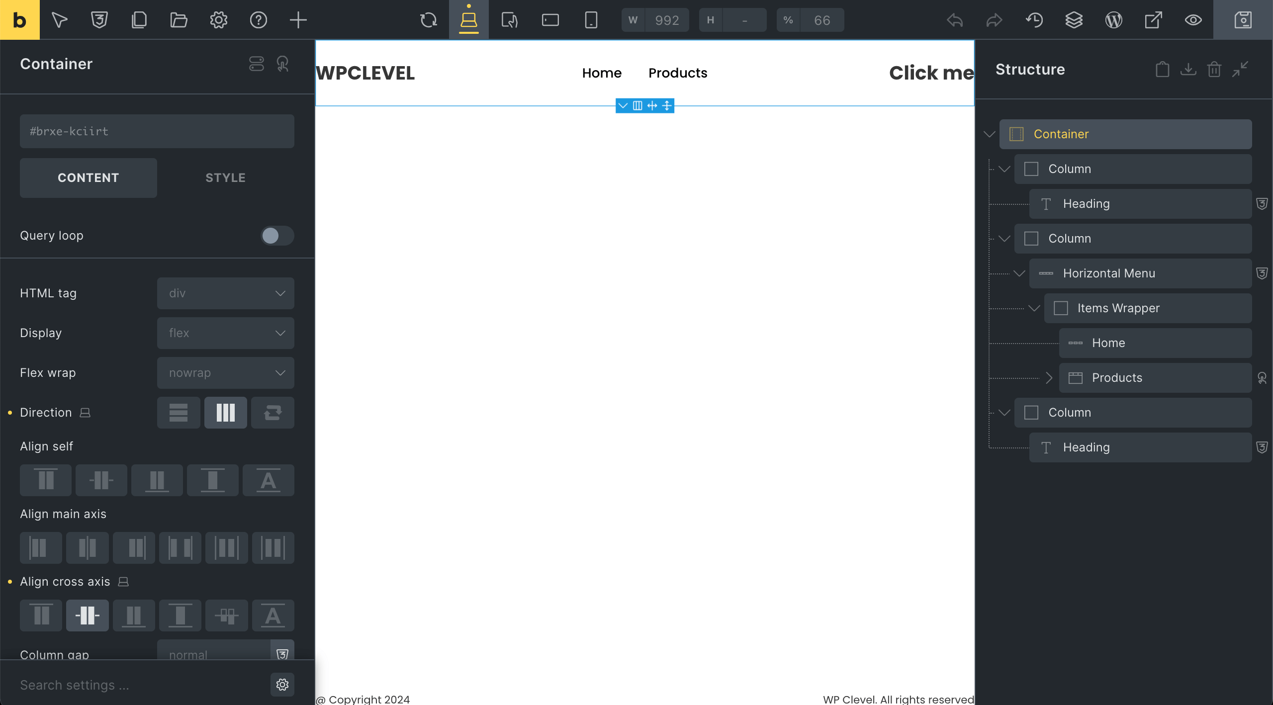
It’s just a Container of three Columns (20%-60%-20% width) centered horizontally. All settings of the Container and Columns are default.
Make sure to enable Sticky else things won’t work.
The structure of the Horizontal Menu is like this:
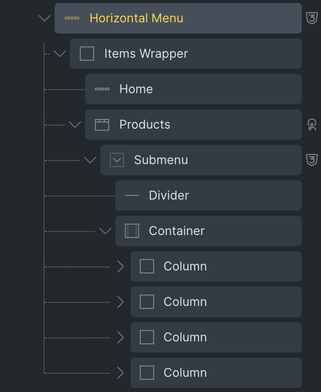
There are two top-level menu items. Below are the settings for them:
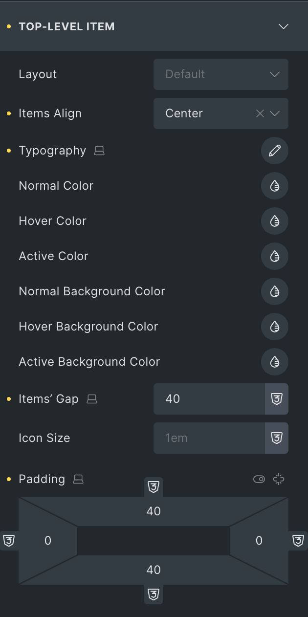
The Vertical Padding of 40px is to make the menu items as height as the Header. You can set whatever value you want.
Set the Horizontal Padding to 0 and set the Gap to 40px so that the Undeline Pointer won’t be longer than the menu item labels.
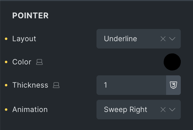
For the Pointer, we will use a dark Underline pointer with Sweep Right animation which is similar to the pointer on the wearemotto.com website.
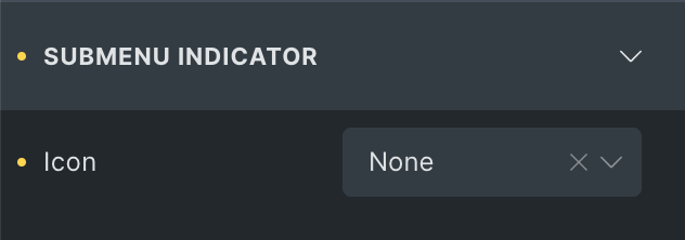
Hide the Submenu Indicator as well:
That’s all with the basic setup. Now, we will customize things to meet our goal.
2. Design the mega submenu
2.1. Design the Submenu element
After enabling Mega, add an Divider element and a Container of four Columns. Leave everything else as default.
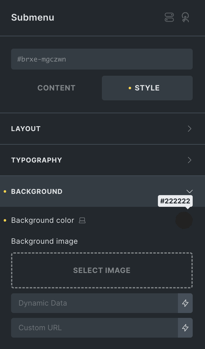
Then, set a dark background color to the Submenu:
2.1.1. Design the Divider element
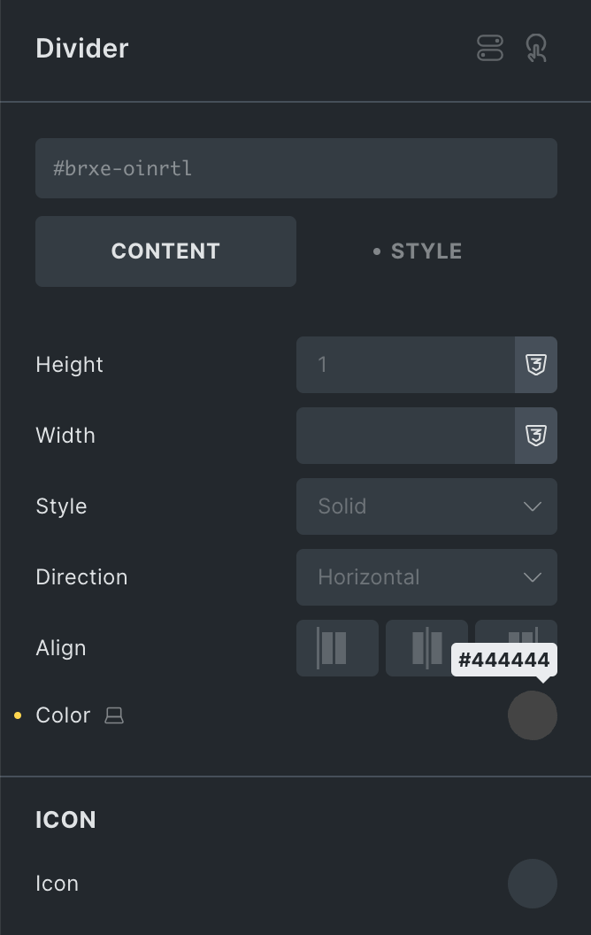
We just need a solid grey Divider:
We have to set a top margin which is equal to the height of the Header so that when the mega submenu drops down, it will look like the bottom border of the Header.
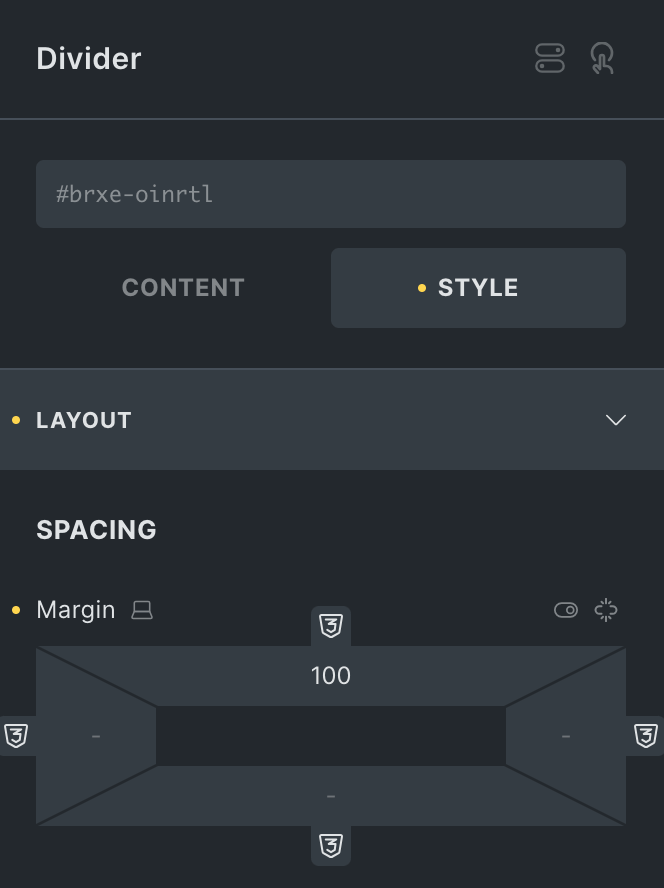
The 100px is the height of the final Header in my setup. You can inspect the height of your Header by using browsers’ inspector tool.
2.1.2. Design the Container element
You can design this element however you want. For the demo, I added four columns of images and text. Added 40px of the Gap between the columns and 40px of Vertical Padding to the Container:
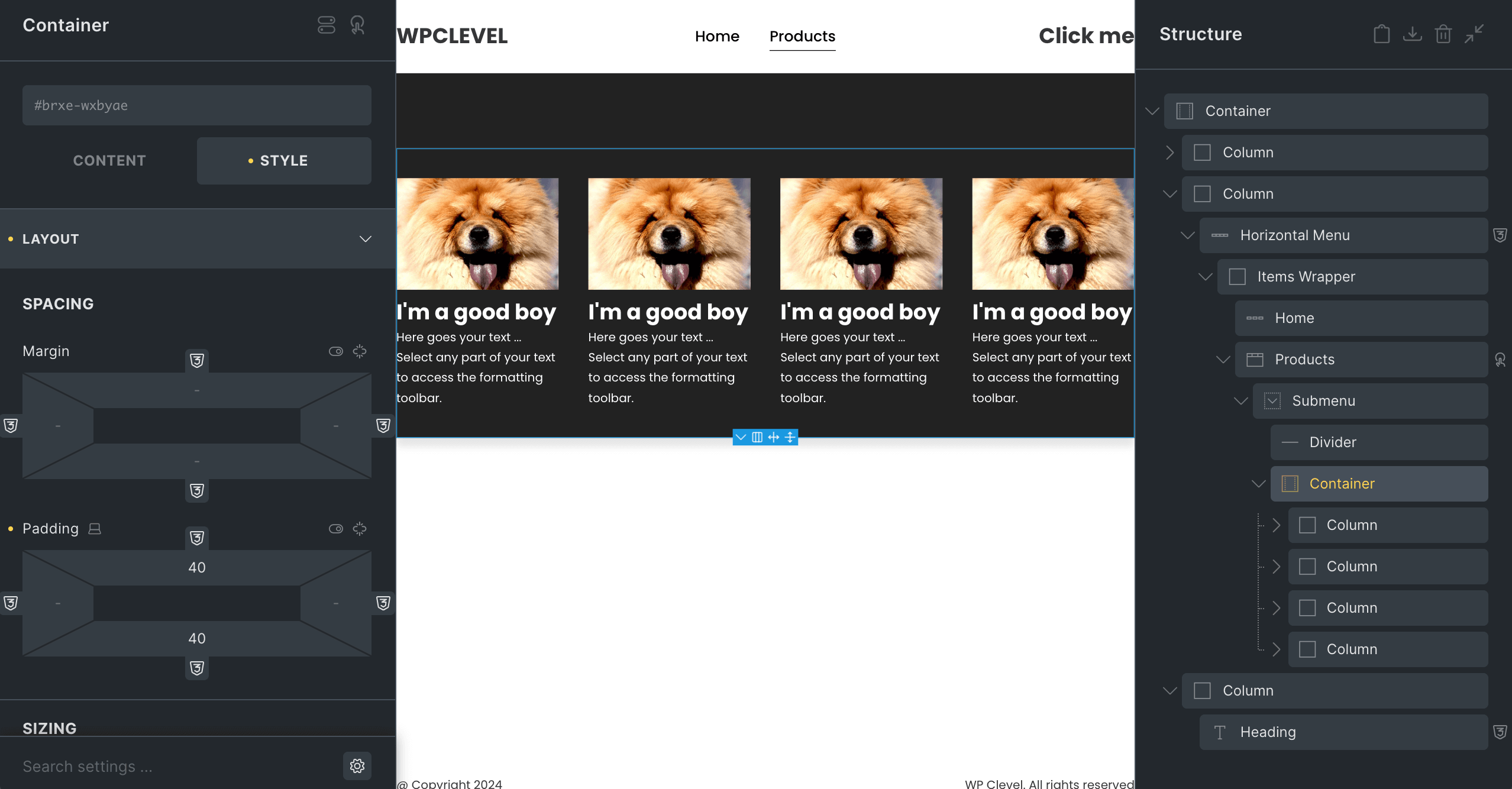
That’s all with designing.
3. Customize the mega submenu
Once the mega submenu is finalized, inspect the element to get its height. We will use that value to animate the height of the mega submenu. In my case, it’s 480px.
Paste the following code into the Custom CSS box of the Submenu element:
%root% {
    height: 0;
    position: fixed;
    top: 0;
    right: 0 !important;
    left: 0 !important;
    opacity: 1 !important;
    visibility: visible !important;
    overflow: hidden;
    transition: height .6s;
    z-index: -1;
}

.mm-hovering-item %root% {
    height: 480px;
}
The code is to:
- Force the mega submenu to be fullscreen width.
- Fix the position of the mega submenu at the top of the screen.
- Show the mega submenu behind some elements with a negative z-index.
- Animate the mega submenu height when its parent menu item being hovered.
It should be like this now:
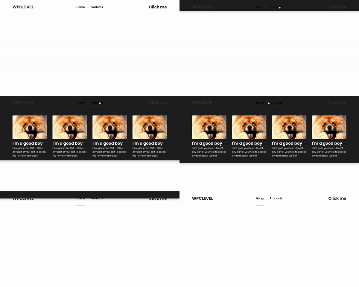
4. Change color of some elements when the mega submenu is active
There are some advanced ways to do it with JS or GSAP. In this tutorial, I will show you an easy way with pure CSS.
First, add two Interactions to the Products menu item:
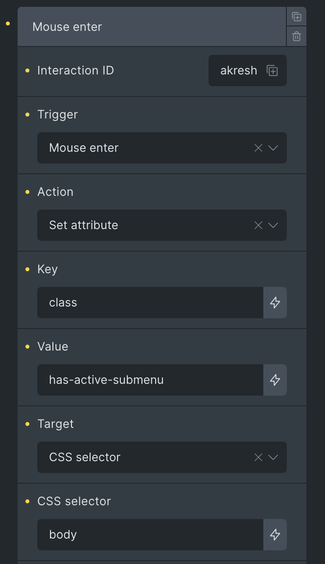
Mouse enter to add a has-active-submenu class to the body when the menu item is being hovered:
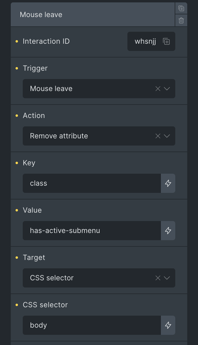
Mouse leave to remove the has-active-submenu class from the body when the menu item is NOT being hovered:
Then, paste below code into the Custom CSS box of the Horizontal Menu element:
%root% .mm-top-item > .mm-item-info::after {
    bottom: 30px;
    transition: transform .4s, background-color .2s;
}

%root% .mm-top-item > .mm-item-info .mm-item-link {
    transition-delay: .4s;
}

.has-active-submenu %root% .mm-top-item > .mm-item-info::after {
    background-color: #fff;
}

.has-active-submenu %root% .mm-top-item > .mm-item-info .mm-item-link {
    color: #fff;
    transition-delay: 0s;
}
The code is to:
- Timing the time to change the color of the menu item labels and the Underline Pointer.
- Lower the distance between a menu item label and the Underline Pointer.
- Change color of the menu item labels and the Underline Pointer when the mega subemnu is active.
Finally, paste below code into the Custom CSS box of the two Heading elements (on the left & right columns of the Header):
%root% {
    transition: color .2s;
    transition-delay: .4s;
}

.has-active-submenu %root% {
    color: #fff;
    transition-delay: 0s;
}
The code is to:
- Timing the time to change the color of the Heading text.
- Change color of the Heading text when the mega subemnu is active.
Now we should have done it:
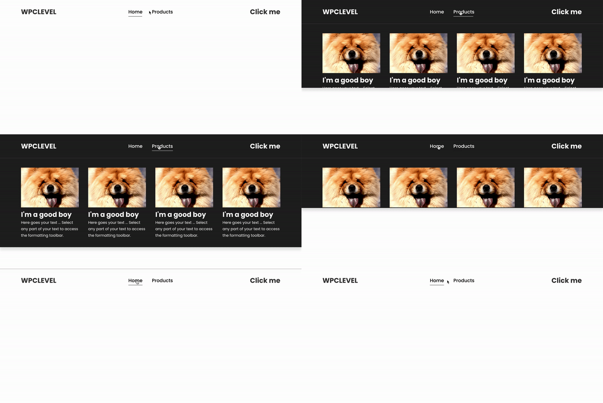
Please note that we used Heading text for the Logo on the left and the Call-To-Action on the right. If it’s not text but images instead, you may take a look at these tutorials:
If you have any problem or any better ideas, let me know in the comment section. Thanks for reading!