Adjust Menu Appearance
Once you have dragged and dropped the “Elemental Menu” widget into a container, your screen may look like this:
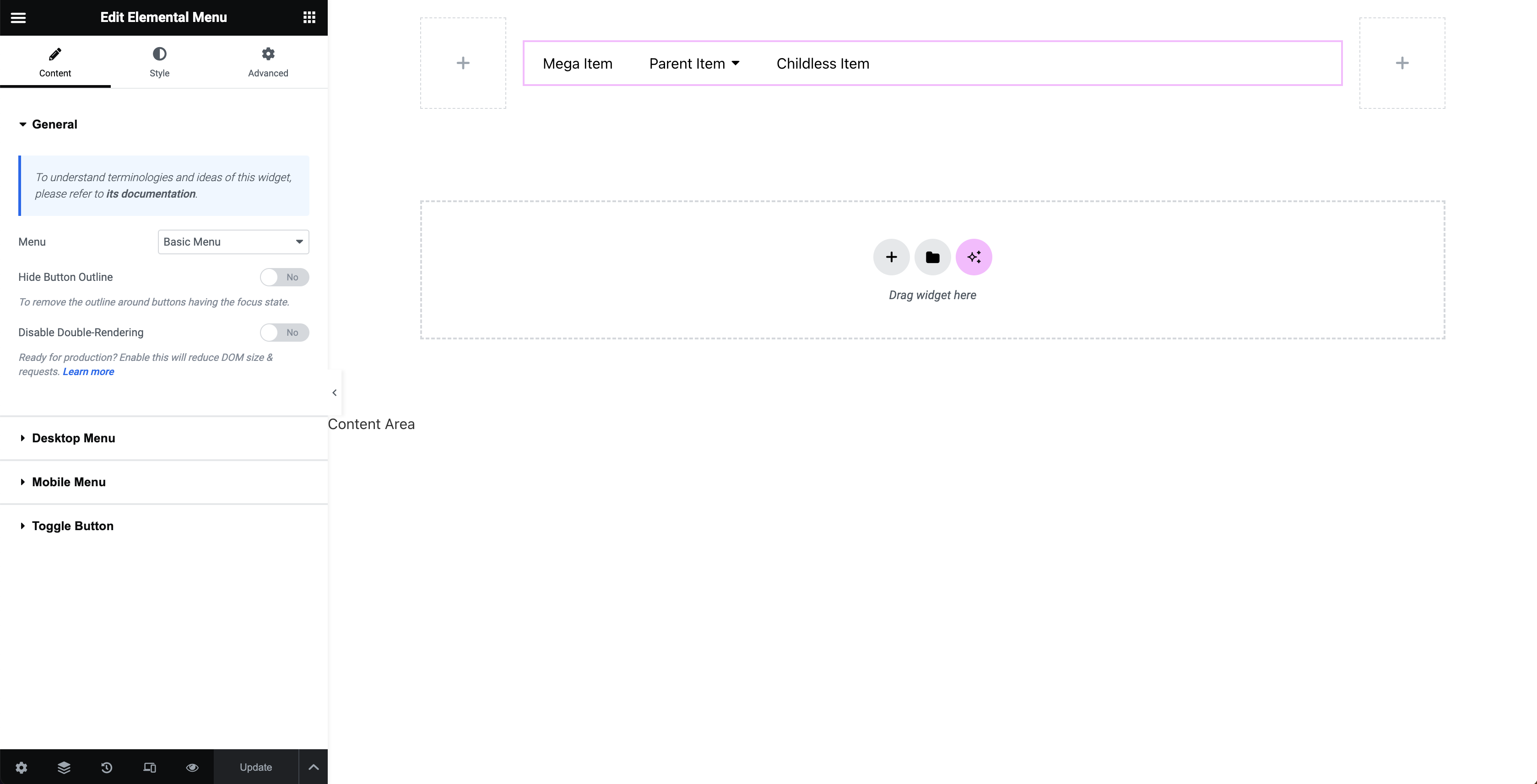
On the left is Elemental Menu widget’s control panel. There are tons of settings to help you customize a menu however you want. Just try them out. Everything is live to help you figure things out quickly.
Make sure to switch to the responsive mode when adjusting the Mobile Menu. Else, you won’t see how Mobile Menu settings get changed.
If you can’t understand something, feel free to reach us out. We will come to help right away.
All good? Let’s move to the next topic: Edit A Menu Item
Last modified: Jun 12 2025 at 05:48 PM.